If you’ve been dabbling in the world of web design using Figma and are now ready to bring those designs to life on the web, you’re in the right place. Figma has become a go-to tool for UI/UX designers thanks to its versatility and ease of use. However, taking a design from concept to code can seem daunting if you’re just starting out.
In this guide, we’ll walk you through the process step-by-step, ensuring that by the end, you’ll have a solid understanding of how to convert your Figma files into dynamic, responsive, and production-ready web pages. Whether you’re aiming to prototype your own projects, enhance your coding skills, or simply want to see your designs in action, this tutorial will equip you with the knowledge to do so.
So, let’s dive into the exciting journey of turning designs into reality with HTML and CSS!
Your Roadmap From a Figma Design to a Functional Webpage
Now that we’ve set the stage for our journey from Figma design to a functional webpage, let’s delve into the specific steps that will guide us through this process. Each step is designed to build upon the last, ensuring a smooth transition from concept to completion. Here’s is the workflow:
1.Getting Your Coding Setup Ready
Picking a Code Editor Choose a developer-friendly tool for writing your code.
Choosing a Web Browser See how your work looks in real-time.
Organizing Project Files & Folders Set up your workspace to make things easy and efficient.
2. Converting the Figma Design Into a Working Webpage
Analyzing the Figma Design Understand the design before you start coding.
Turning the Design into HTML Start making your webpage’s basic layout.
Making HTML Look Good with CSS: Add colors and styles to make your webpage look nice across devices and browsers.
3.Improving Your Webpage:Test and refine your webpage until it’s just right.
4. Showing Off Your Finished Work: See what you’ve made after all your hard work.
Ready to get your feet wet? Let’s get started!
Step-by-Step Guide: Converting Figma Designs to HTML Code
Getting Your Coding Setup Ready
Before turning your Figma designs into HTML, it’s important to set up your coding environment. In this section, we’ll cover three key steps: picking the right code editor and web browser, and organizing your project files. Getting these basics in order will make the coding process smoother and more efficient, ensuring you’re ready to bring your designs to life with ease.
Picking a Code Editor
First off, you need to choose a code editor for your Figma to HTML conversion project, such as Visual Studio Code or Sublime Text to write code. Given the extensive features, extensions and resources, Visual Studio Code (VS Code) is the number one solution for front-end development projects.
Apart from the basic functions that every developer needs, VS Code allows you to seamlessly integrate additional plugins (extensions) that make this code editor a true web development powerhouse. For example, the Sourcery extension enables developers to write clean code, which is easy to debug and update, improving the overall user experience.
We will be using VS Code in this tutorial.
Choosing a Web Browser
Next, pick a web browser to preview your work as you do it. Your choice depends on several factors, including your personal preference, the specific requirements of your project, and the features provided by different browsers. Some popular web browsers commonly used for UI development are Google Chrome, Mozilla Firefox, and Safari. For this tutorial, we’ll be using Firefox.
Organizing Project Files and Folders
Finally, you need to set up your workspace to make things easy and efficient. Create a new folder for your project and set up the necessary files and folders, including HTML, CSS, and any additional assets like images or fonts.
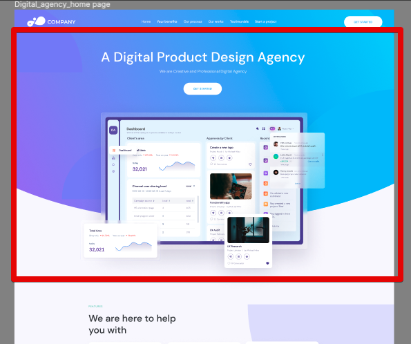
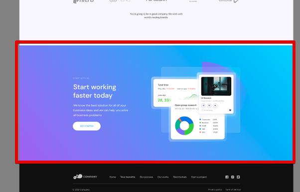
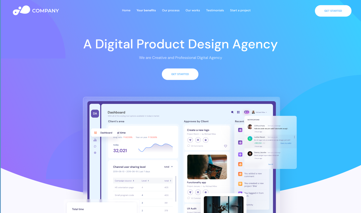
For this tutorial, we will be using this Figma design, which is a generic digital agency landing page:
Here’s how your project structure should look like in a code editor:
project-name/
│
├── assets/
│ ├── images/
│ │ └── (place your image files here)
│ ├── fonts/
│ │ └── (place your font files here)
│ └── css/
│ └── styles.css
│
├── index.html
└── README.md
Folder/File
Purpose
project-name/
This is the root directory of your project. Replace “project-name” with the name of your project.
assets/
This directory holds all the static assets used in your project, such as images, fonts, and CSS files.
images/
Stores all image files used in your project, including logos, icons, background images, etc.
fonts/
Place any custom font files (e.g., .woff, .woff2) here if you’re using custom fonts in your design.
css/
This is where your CSS files reside. The main stylesheet, styles.css, will be placed here.
index.html
This is the main HTML file for your project. It will contain the structure of your web page and a link to your CSS file.
README.md
A markdown file containing information about your project, including a brief description, instructions for setup, and any other relevant details. This could be optional depending on the use case.
Converting the Figma Design Into a Working Webpage
Once you’ve set up your development environment, it’s time to roll up your sleeves and dive into the process of turning the sample Figma design into a full-fledged webpage.
In this section, we’re going to walk through each step necessary to bring the webpage from a concept in Figma to a fully functioning presence on the web. You’ll start by thoroughly understanding the Figma design, ensuring you know exactly what we’re aiming for before you write a single line of code.
Next, you’ll begin the exciting work of translating that design into HTML, laying down the basic structure of the webpage.
And finally, you’ll use CSS to add all the visual flair—colors, styles, and layout adjustments—that will make the webpage not just functional, but visually stunning as well.
Analyzing the Figma Design
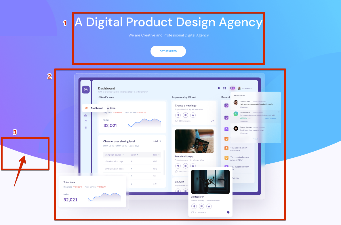
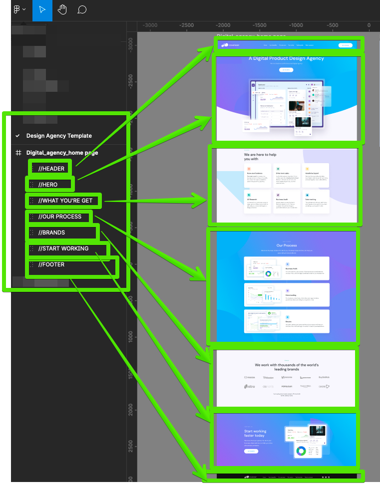
Before you start coding, it’s essential to dissect the design in the Figma project carefully. This process involves understanding the overall structure and identifying the key components that make up the webpage and their sizes.
Breaking down the design into main sections.
As you see in the screenshot below, the web page consists of the header, hero section, footer, and other blocks.
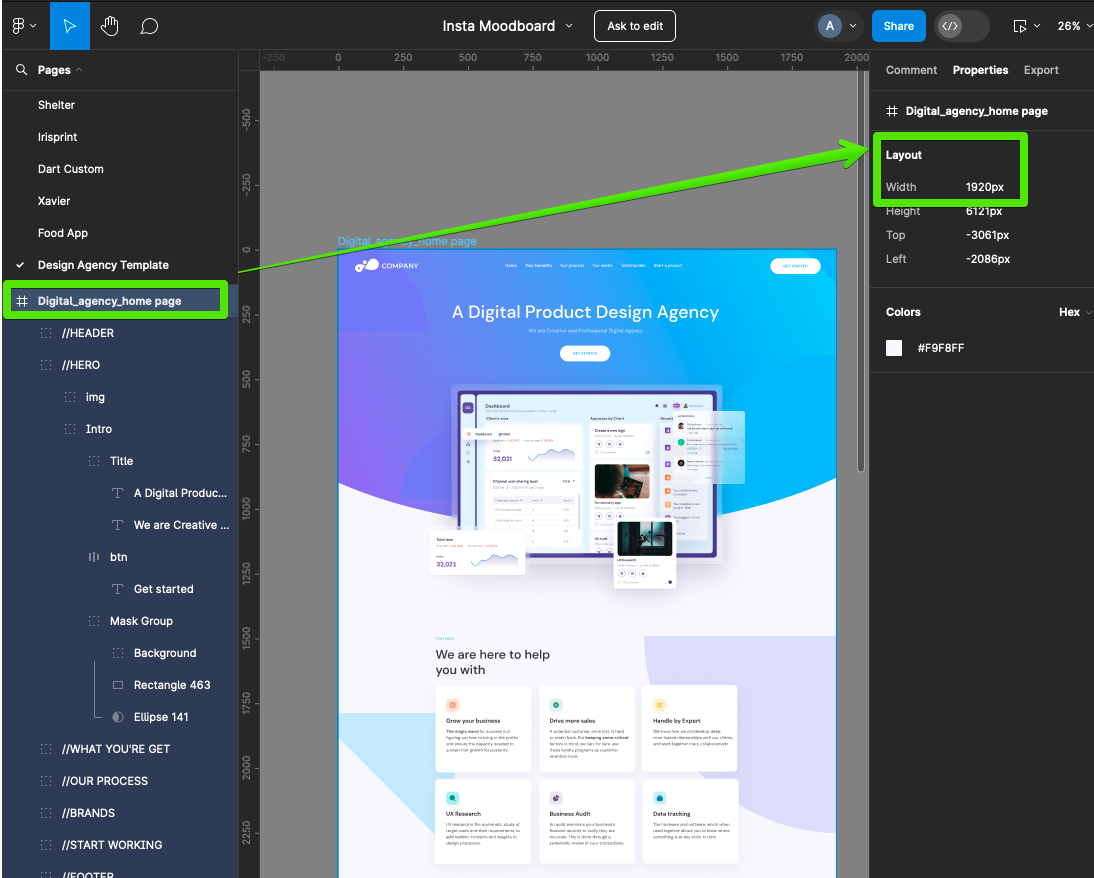
Finding out the layout width.
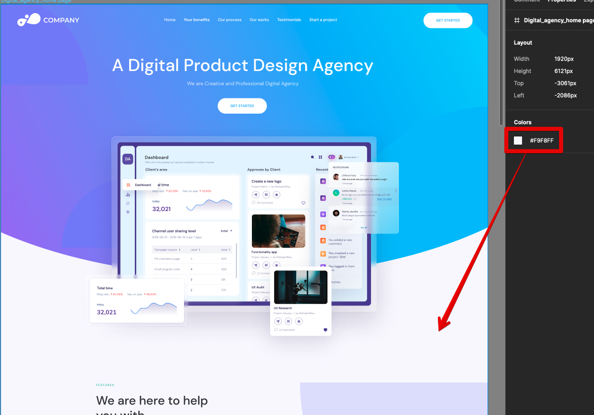
The design is crafted for a layout width of 1,920px. This dimension is crucial as it ensures the design appears pixel-perfect on screens of this size.
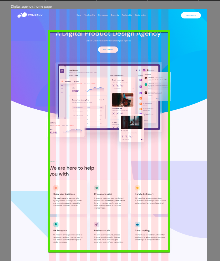
Finding out the container’s size.
Next, we need to determine the design container’s size by selecting the Layout grids option in the main menu or by hitting Shift+G on the keyboard.
In this case, we have a 12 grid layout, which is very common in the modern UI design. The container’s size matches the layout grid width at 1,170px, with a gutter or grid spacing of 30px.
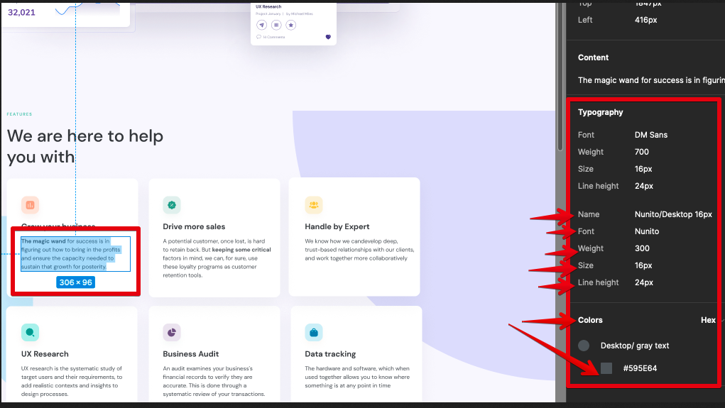
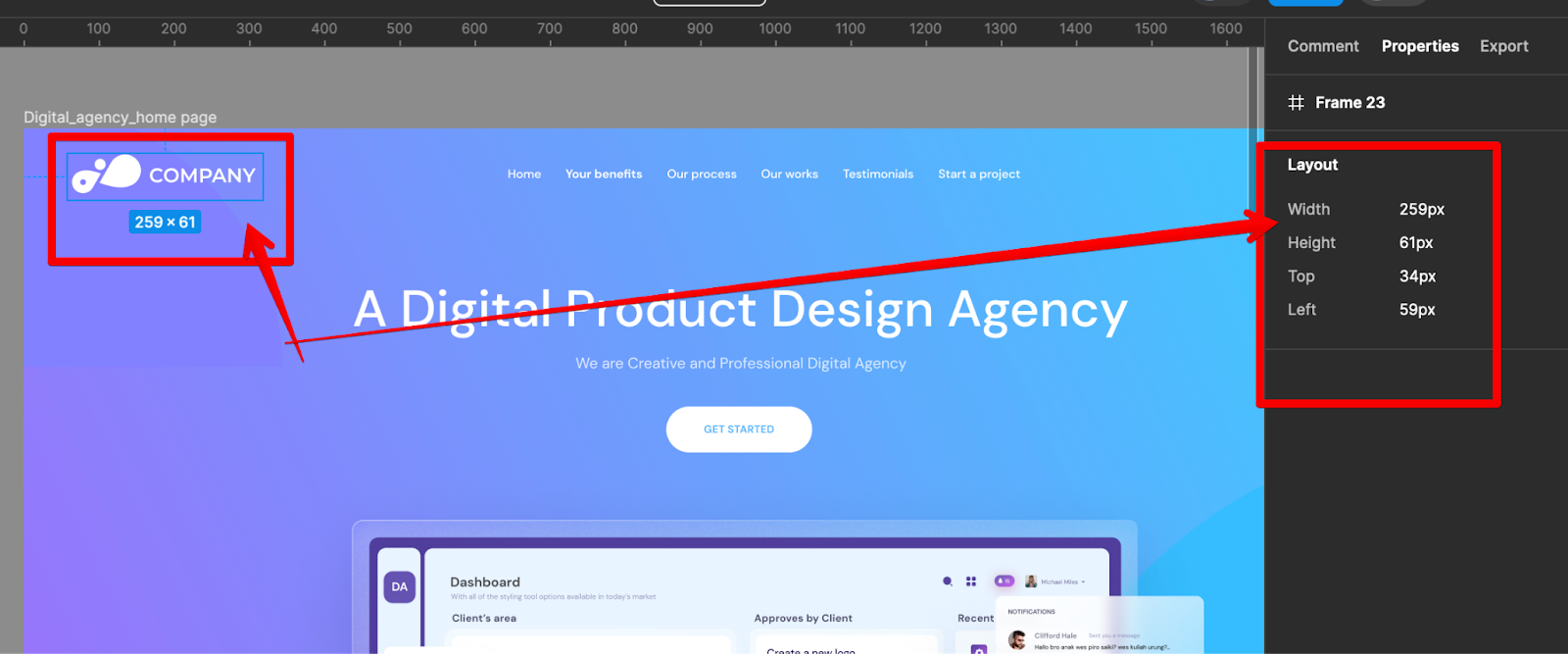
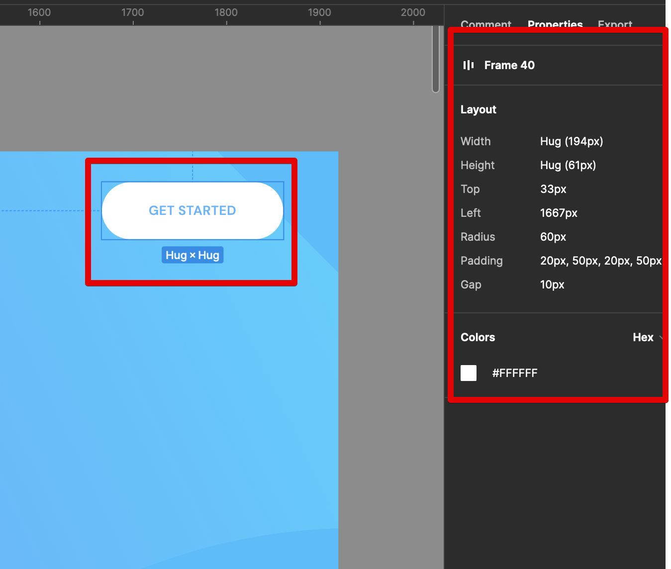
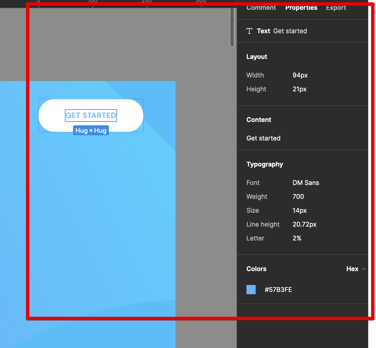
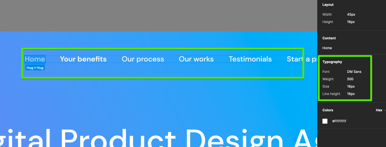
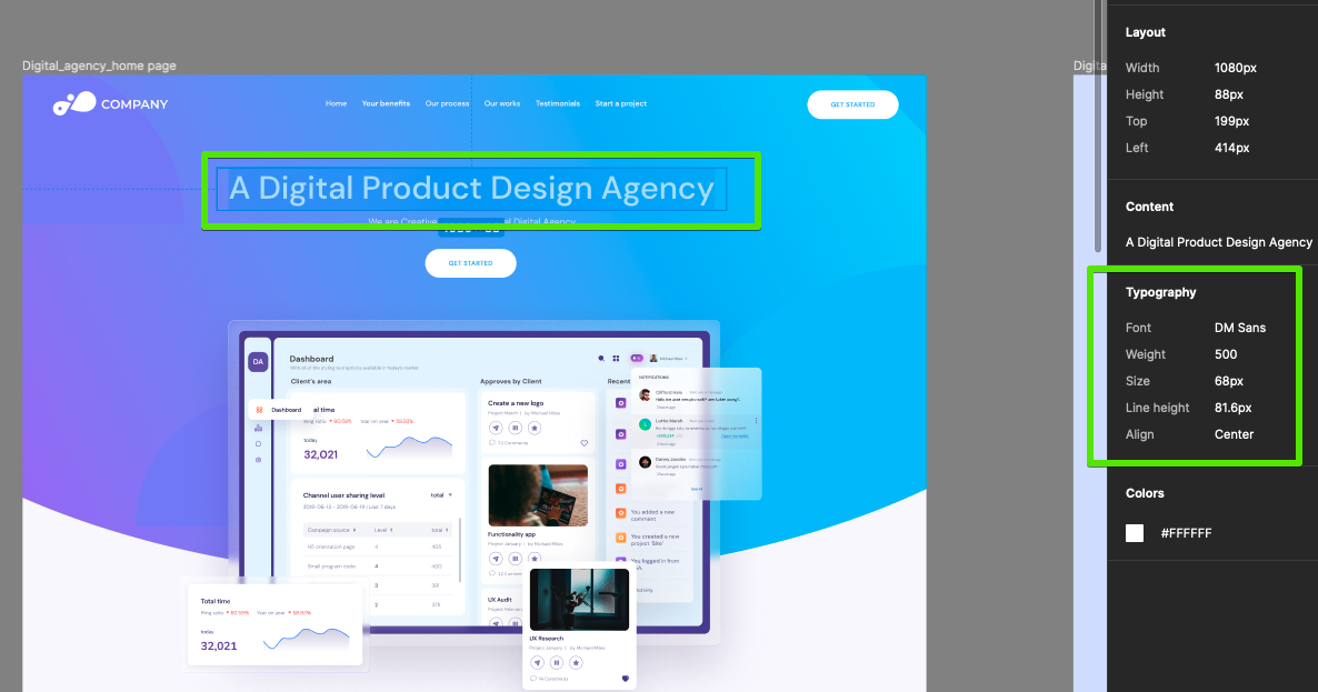
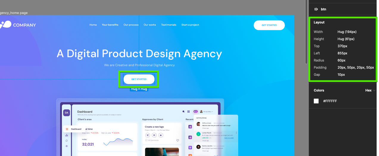
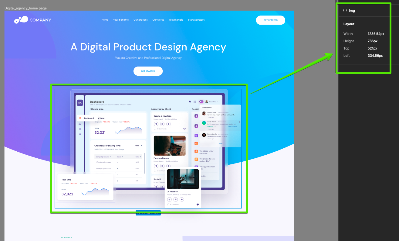
Inspecting the properties of the design components.
Let’s dive deeper into the design specifics and inspect the characteristics of its elements. These include colors, margins, padding, backgrounds, image sizes, etc.
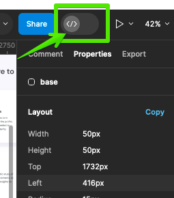
The ideal way of inspecting Figma designs is by enabling the Dev Mode.
Now, with one click on any element, text, image, or section, you can see its CSS properties on the right.
Inspecting the Navbar typography properties
Inspecting the typography properties of a heading
Inspecting the properties of a button
Inspecting the properties of an image
We’ll use all of those dimensions and details later in the code.
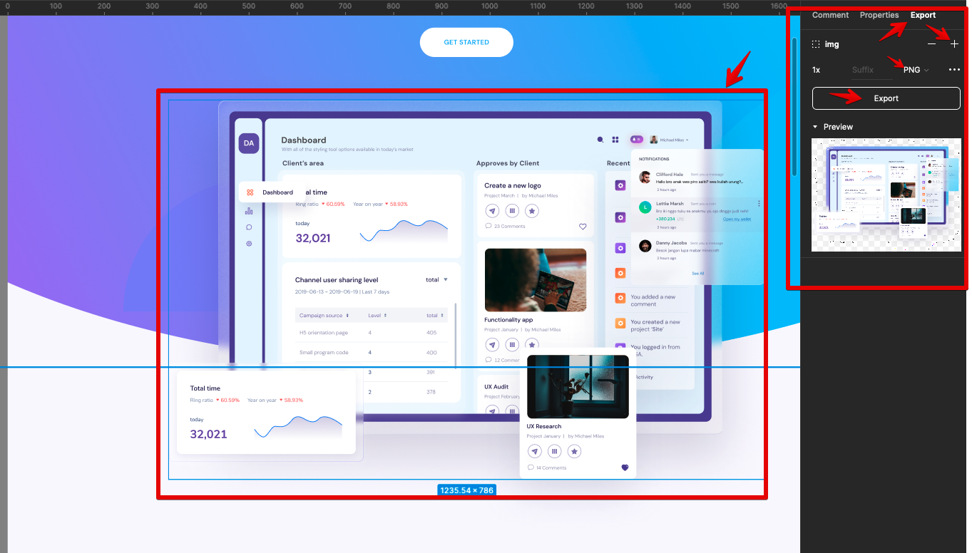
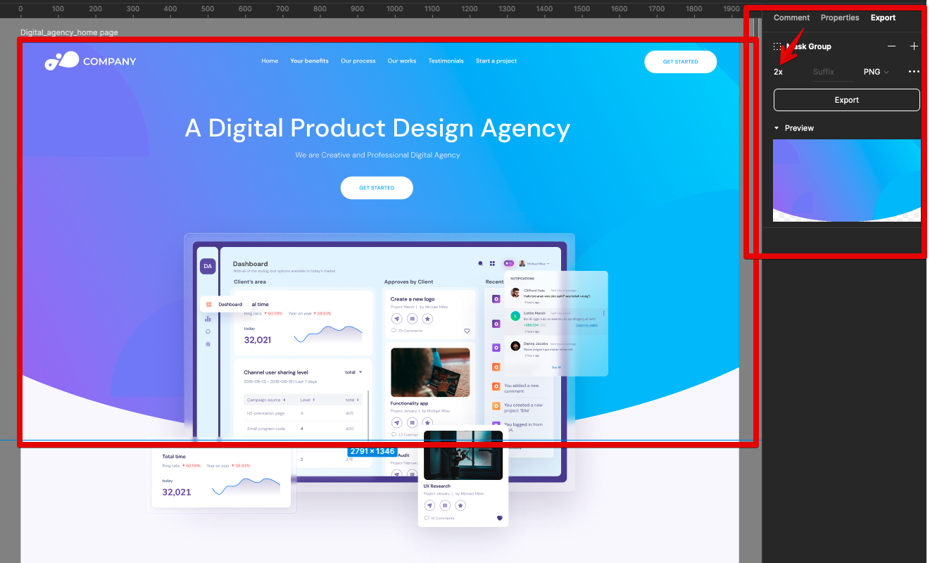
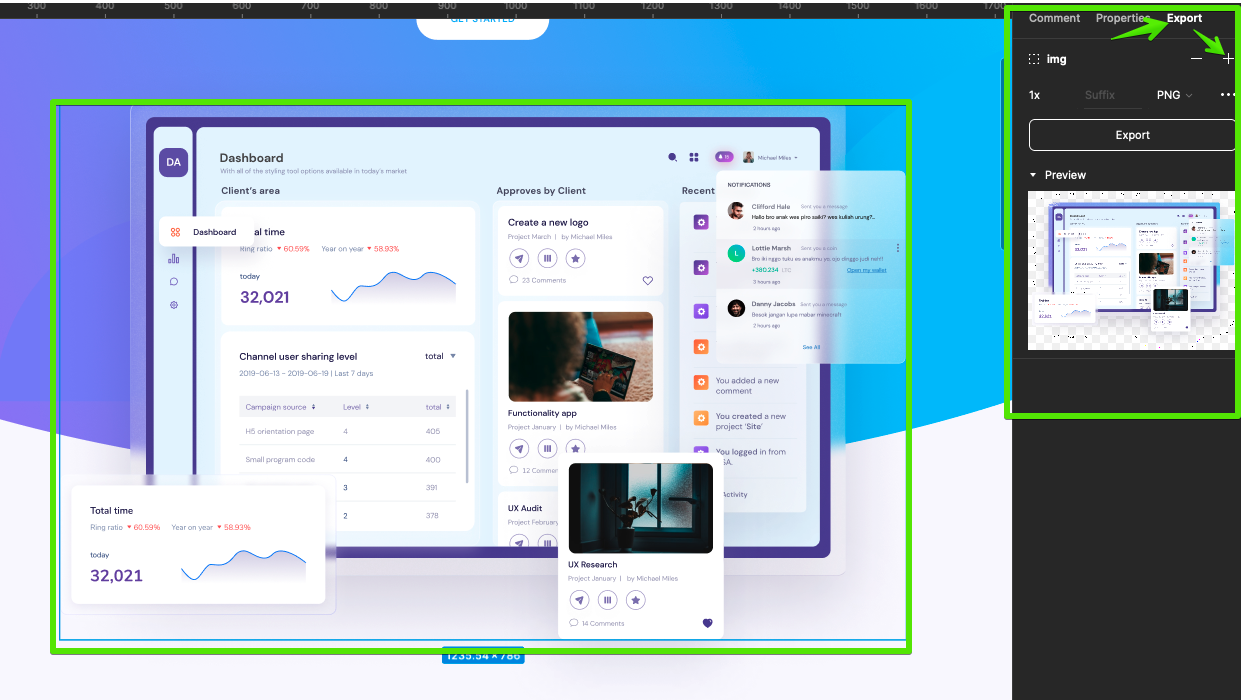
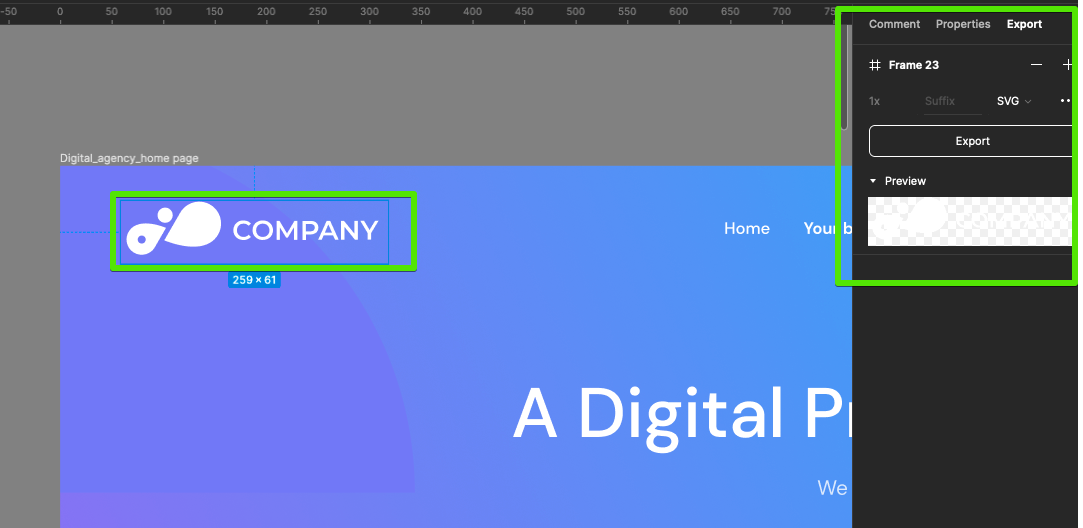
Exporting the design assets.
Another important step to take before we start coding is to export certain design elements like images and icons. You can choose from among a variety of design formats like .png or .jpg with a lower or higher quality, depending on your needs.
create
NOTE To export Figma to HTML without having to do it manually, you could use a Figma plugin such as Anima. That will ceratainly speed up development. Keep in mind, though, that the code generated by a plugin like that is often of inferior quality.
It frequently falls short when it comes to meeting accessibility standards like ADA, isn’t great for SEO, doesn’t match the design exactly (not pixel-perfect), and includes extra instructions from the plugin that might slow down your website.
To use SVG images directly and create font icons, we can export assets in the SVG format.
Understanding the design’s layout and structure.
Finally, take a close look at the layout and structure of the design, paying particular attention to how elements are positioned relative to each other and how they respond to different screen sizes.
Turning the Design Into HTML
After meticulously analyzing the design, breaking it down into specific sections, determining the dimensions of each element, and exporting the required assets, you’re now poised to breathe life into our design by translating it into HTML code.
This phase is where the visual becomes functional, where the abstract design concepts are molded into tangible, interactive web components. Here are the steps involved in this transformation:
Start with the HTML structure. The first step is to create an HTML file and begin laying the foundation of your webpage. This involves structuring your document to mirror the layout observed in the Figma design. You’ll use HTML tags such as `<header>`, `<nav>`, `<section>`, `<div>`, and others to delineate different parts of the design, ensuring each segment of your webpage is represented semantically and logically.
Add content and elements. With the skeleton of your HTML structure in place, the next step is to populate it with content. This includes inserting text, images, buttons, and other elements as dictated by the Figma design. It’s crucial at this stage to pay close attention to the specifics of the design to ensure that the content aligns perfectly with the intended layout and aesthetic
Seamless Figma to HTML
Conversion
Get a high-quality, accessible,
and fully responsive website fast.
So, let’s move on to the most exciting part of the Figma to HTML conversion process.
Structuring the HTML markup to match the design layout.
Follow these steps:
Open the index.html file in the VS Studio. You can leverage the editor’s default snippet to quickly write a basic HTML skeleton. For this purpose, type the exclamation mark (!) and hit TAB on the keyboard. Here’s the result:
Create one unique page wrapper element inside the body tag. It will hold all the nested elements on this page. We will give this div element a unique id page-wrapper. For styling purposes, give the same value as the class name, page-wrapper.
<!DOCTYPE html>

<html lang="en">

<head>

    <meta charset="UTF-8">

    <meta name="viewport" content="width=device-width, initial-scale=1.0">

    <title>A Digital product Design Agency</title>

</head>

<body>

    <!-- Page Wrapper -->

    <div id="page-wrapper" class="page-wrapper">

        <!-- All page sections will go here -->

    </div>
 </body>

</html>
Create a generic semantic structure of the page by dividing it into header, main section, and footer. Put all of these inside the page-wrapper that we created in the previous step.
We’ll focus on writing HTML according to the design without worrying about any UI library or framework like Tailwind, since we will be developing this project only using vanilla HTML and Vanilla CSS.
Break down the design into sections and components.
The Header Section
In the header section we have three components:
Logo
Navigation
Button (reusable component)
Write the HTML code for the header section and its components. The three components will be the header section’s children.
<!-- Logo -->
<div class="logo">
    <a href="#">
        <img src="assets/images/logo.svg" alt="image alternative text" />
    </a>
</div>
Note that to create this logo component, we need to export the logo image from the design as an .svg file and save it to the assets/images/ folder.
The Navigation component (HTML):
<!-- Navigation -->
<nav id="nav" class="nav">
    <!-- Nav opener for mobile burger menu -->
    <a href="#" class="nav__opener"><span class="icon-menu"></span></a>
    <!-- Nav menu holder -->
    <div class="nav__holder">
        <!-- Nav closer for mobile burger menu -->
        <a href="#" class="nav__opener nav__opener--close"><span class="icon-close"></span></a>
        <ul class="nav__menu">
            <li>
                <a href="#">Home</a>
            </li>
            <li>
                <a href="#">Your benefits</a>
            </li>
            <li>
                <a href="#">Our process</a>
            </li>
            <li>
                <a href="#">Our works</a>
            </li>
            <li>
                <a href="#">Testimonials</a>
            </li>
            <li>
                <a href="#">Start a project</a>
            </li>
        </ul>
    </div>
</nav>
You should notice that here we have nav__opener and nav__opener–close classes, which we’ll use to create the mobile menu. The icon-menu and icon-close classes are icons. We will talk about using them in the text below. For now, we just need to understand that we are using icons with these predefined class names.
Within the button component, we have two classes btn and header__btn. We will use the btn class as a generic reusable class and header__btn to style it as specific to the header only.
To wrap up our discussion of the header section structure, here is the complete code:
<!-- Page Header Area-->
<header id="header" class="header">
<!-- Logo -->
<div class="logo">
<a href="#">
<img src="assets/images/logo.png" alt="Logo" />
</a>
</div>
<!-- Navigation -->
<nav id="nav" class="nav">
<!-- Nav opener for mobile burger menu -->
<a href="#" class="nav__opener"><span class="icon-menu"></span></a>
<!-- Nav menu holder -->
<div class="nav__holder">
<!-- Nav closer for mobile burger menu -->
<a href="#" class="nav__opener nav__opener--close"><span class="icon-close"></span></a>
<ul class="nav__menu">
<li>
<a href="#">Home</a>
</li>
<li>
<a href="#">Your benefits</a>
</li>
<li>
<a href="#">Our process</a>
</li>
<li>
<a href="#">Our works</a>
</li>
<li>
<a href="#">Testimonials</a>
</li>
<li>
<a href="#">Start a project</a>
</li>
</ul>
</div>
</nav>
<!-- Button -->
<a href="#" class="btn header__btn">Get Started</a>
</header>
The Main Section
The main section is the page section with content between the header and the footer. Let’s break it down into the content areas with their relevant content:
The Hero section is the first section after the header, which acts like a banner for the page:
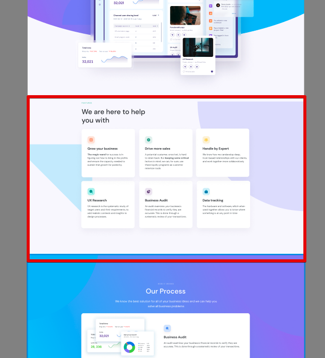
The Services section provides information regarding the agency’s services:
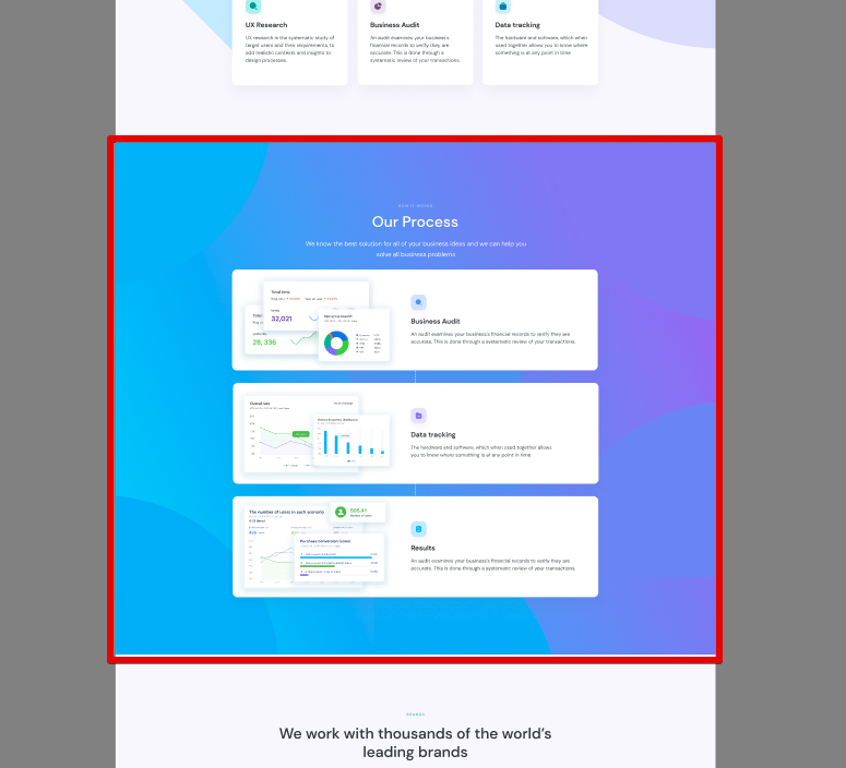
The Process section provides information about the agency’s processes:
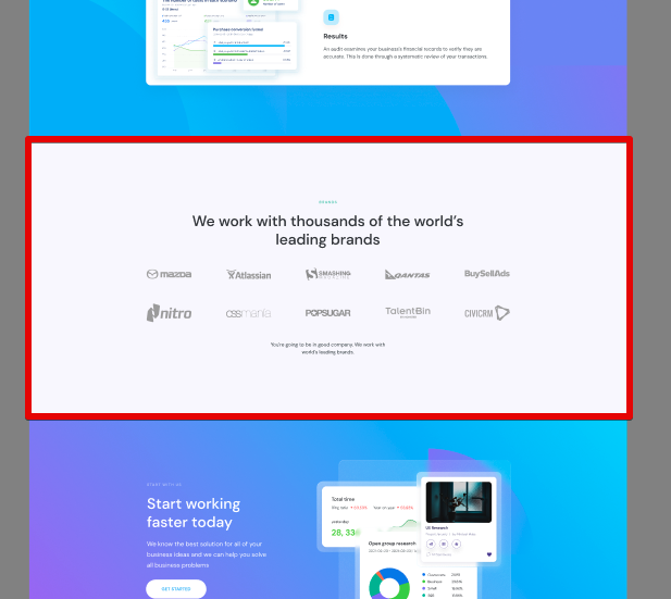
The Brands section contains the agency’s portfolio and lists the agency’s prominent clients and brands:
The Contact section contains a button that visitors can use to get in touch with the agency:
This is the main section’s HTML from a bird’s eye view:
Make sure to export two image assets for the Hero section:
Hero section main image:
Hero section main image
The Hero section decorative image. For the best background quality, select x2 when exporting this image.
Hero section decorative image
The Services Section Design Breakdown and HTML Code
The Services section consists of three components:
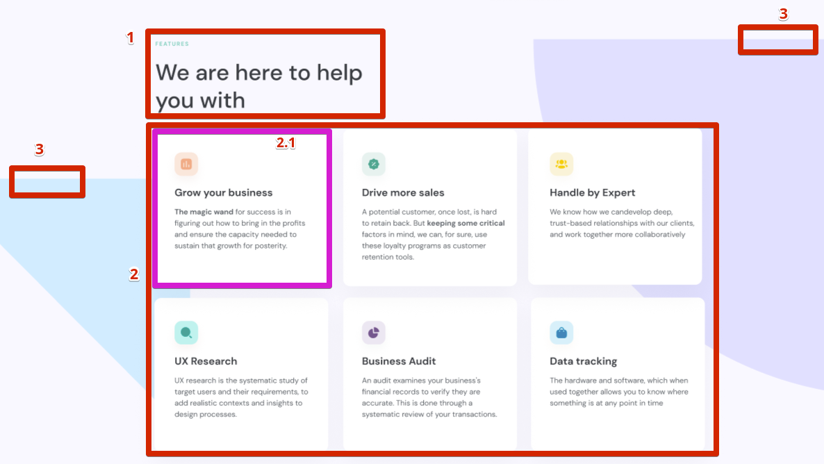
Services section intro(1), containing a reusable text-highlight component and a generic heading.
Services section row (2). A row includes three columns (2.1) containing a reusable Info Card component. The Info Card component itself includes a reusable Icon Box component. For the icon, we will use the IcoMoon font generator, which allows us to create custom icons according to our design on the Free plan as well. There are other options like FontAwesome but it has limited sets of icons and does not allow you to create custom icons in the Free plan.
To generate icons, you need to export design icons in the SVG format. Scroll to the bottom of the tutorial to learn about creating icons with IcoMoon. At this stage, however, you don’t have to worry about it since this is a part of the CSS setup.
Services section decorative images (3). We will put these two decorative shapes inside one div component.
Let’s create the HTML code for the Services section’s components we’ve just described:
Services section intro:
!-- Services Section Intro -->
<div class="services-section__intro">
    <!-- Reusable text-highlight component -->
    <strong class="text-highlight">features</strong>
    <h2>We are here to help you with</h2>
</div>
Services section row: Here, you only need to create one services-section__column block and then copy-paste it six times, changing the content in every block according to the design:
<!-- Services Section Row -->
<div class="services-section__row">
    <!-- Service Section Column -->
    <div class="services-section__column">
        <article class="info-card">
            <!-- Reusable Icon Box -->
            <div class="icon-box">
                <!-- Font icon element -->
                <span class="icon-chart"></span>
            </div>
            <h3>Grow your business</h3>
            <p>
                <strong>The magic wand</strong> for success is in figuring
                out how to bring in the profits and ensure the capacity
                needed to sustain that growth for posterity.
            </p>
        </article>
    </div>
</div>
Putting it all together, here is the complete HTML code of the Services section:
<!-- Services Section -->
<section class="services-section">
<!-- Generic page container -->
<div class="container">
<!-- Services Section Intro -->
<div class="services-section__intro">
<!-- Reusable text-highlight component -->
<strong class="text-highlight">features</strong>
<h2>We are here to help you with</h2>
</div>
<!-- Services Section Row -->
<div class="services-section__row">
<!-- Service Section Column -->
<div class="services-section__column">
<article class="info-card">
<!-- Reusable Icon Box -->
<div class="icon-box">
<!-- Font icon element -->
<span class="icon-chart"></span>
</div>
<h3>Grow your business</h3>
<p>
<strong>The magic wand</strong> for success is in figuring
out how to bring in the profits and ensure the capacity
needed to sustain that growth for posterity.
</p>
</article>
</div>
<div class="services-section__column">
<article class="info-card">
<!-- Reusable Icon Box -->
<div class="icon-box icon-box--soft-green">
<!-- Font icon element -->
<span class="icon-discount"></span>
</div>
<h3>Drive more sales</h3>
<p>
A potential customer, once lost, is hard to retain back. But
<strong>keeping some critical</strong> factors in mind, we
can, for sure, use these loyalty programs as customer
retention tools.
</p>
</article>
</div>
<div class="services-section__column">
<article class="info-card">
<!-- Reusable Icon Box -->
<div class="icon-box icon-box--yellow">
<!-- Font icon element -->
<span class="icon-users"></span>
</div>
<h3>Handle by Expert</h3>
<p>
We know how we candevelop deep, trust-based relationships
with our clients, and work together more collaboratively
</p>
</article>
</div>
<div class="services-section__column">
<article class="info-card">
<!-- Reusable Icon Box -->
<div class="icon-box icon-box--bright-green">
<!-- Font icon element -->
<span class="icon-search"></span>
</div>
<h3>UX Research</h3>
<p>
UX research is the systematic study of target users and
their requirements, to add realistic contexts and insights
to design processes.
</p>
</article>
</div>
<div class="services-section__column">
<article class="info-card">
<!-- Reusable Icon Box -->
<div class="icon-box icon-box--purple">
<!-- Font icon element -->
<span class="icon-graph"></span>
</div>
<h3>Business Audit</h3>
<p>
An audit examines your business's financial records to
verify they are accurate. This is done through a systematic
review of your transactions.
</p>
</article>
</div>
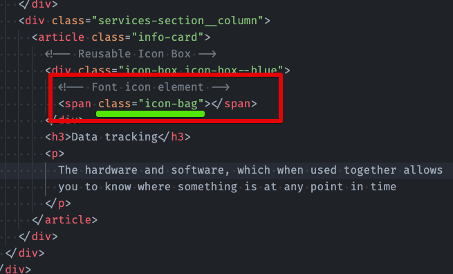
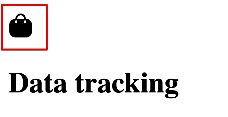
<div class="services-section__column">
<article class="info-card">
<!-- Reusable Icon Box -->
<div class="icon-box icon-box--blue">
<!-- Font icon element -->
<span class="icon-bag"></span>
</div>
<h3>Data tracking</h3>
<p>
The hardware and software, which when used together allows
you to know where something is at any point in time
</p>
</article>
</div>
</div>
</div>
<!-- Services Section decorative images -->
<div class="services-section__decor">
    <div class="services-section__decor-img">
        <img src="assets/images/services-decor-left.png" alt="Decor" />
    </div>
    <div class="services-section__decor-img">
        <img src="assets/images/services-decor-right.png" alt="Decor" />
    </div>
</div>
</section>
The Footer Section
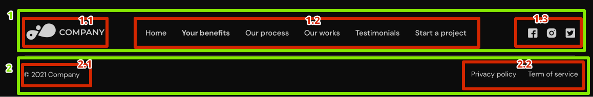
Let’s break down the footer section into its constituent parts:
The footer has two subsections:
Footer Holder 1.1. Footer Logo 1.2. Footer Navigation 1.3 Social Networks
Footer Bar 2.1. Copyright notice 2.2. Privacy policy and Terms of service links
Having the HTML structure of your web page in place is a crucial first step towards creating a functional website. However, it’s not enough if you’re looking to engage and retain visitors. The next essential step is to make your website visually attractive.
This is where CSS, or Cascading Style Sheets, comes into play. Think of HTML as the skeleton of your website, providing the basic structure, while CSS acts as the attire, adding style and personality. It is a powerful tool that allows you to control the layout, colors, fonts, and overall visual appeal of your website, without altering the underlying HTML structure.
Now, let’s make our page as beautiful as it looks in the design. Follow these steps:
Link the CSS file to index.html:
Create the styles.css file inside the assets/css directory: assets/css/styles.css
Link your HTML file to a CSS file using the <link> tag within the <head> section of your HTML document:
Add the general browser CSS reset and base styles to styles.css.
When you make a website, it should look the same on all browsers like Chrome, Firefox, or Safari. However, each browser has its own set of rules for how things like text and buttons should look. This can make your website appear different and maybe not as nice on different browsers.
To fix this, we use a General Browser CSS Reset. Think of it as making all browsers forget their own rules so we can start fresh. This way, when we add our own styles, everything looks the same no matter where you view the website.
We also set up base styles. This is like deciding what font, color, and size all the texts should be from the start. It makes sure your website looks consistent and neat everywhere.
So, by resetting browser styles and setting up base styles, we make sure your website looks good and the same on all browsers. Here are the respective rule sets:
/* General browser CSS and base styles */

/**
 * Set up a decent box model on the root element
 */

html {
    box-sizing: border-box;
}

/**
   * Make all elements from the DOM inherit from the parent box-sizing
   * Since `*` has a specificity of 0, it does not override the `html` value
   * making all elements inheriting from the root box-sizing value
   * See: https://css-tricks.com/inheriting-box-sizing-probably-slightly-better-best-practice/
   */

*,
*::before,
*::after {
    box-sizing: border-box;
}

/* body has default margin */
body {
    margin: 0;
}

/* h1-h6 has default margin top/bottom */
h1,
h2,
h3,
h4,
h5,
h6 {
    margin: 0 0 20px;
}

/* p tag has default margin top/bottom */
p {
    margin: 0 0 20px;
}

/* ul/ol has default margin, padding, and list style like bullets */
ul,
ol {
    margin: 0;
    padding: 0;
    list-style: none;
}

/* anchor tag has default decoration underline */
a {
    text-decoration: none;
}

/* Responsive image property */
img {
    max-width: 100%;
    height: auto;
}

/*
  Page wrapper styles:
  This style will not let any elements overflow from the page wrapper
  */
#page-wrapper {
    position: relative;
    overflow: hidden;
}
Apply the overall design styles.
First, inspect the design for general style properties:
Body background properties
Body typography properties
Now, add the appropriate CSS rules to style the HTML elements based on the visual design in Figma. Use CSS properties like font-size, color, margin, padding, background, etc., to achieve the desired look and feel:
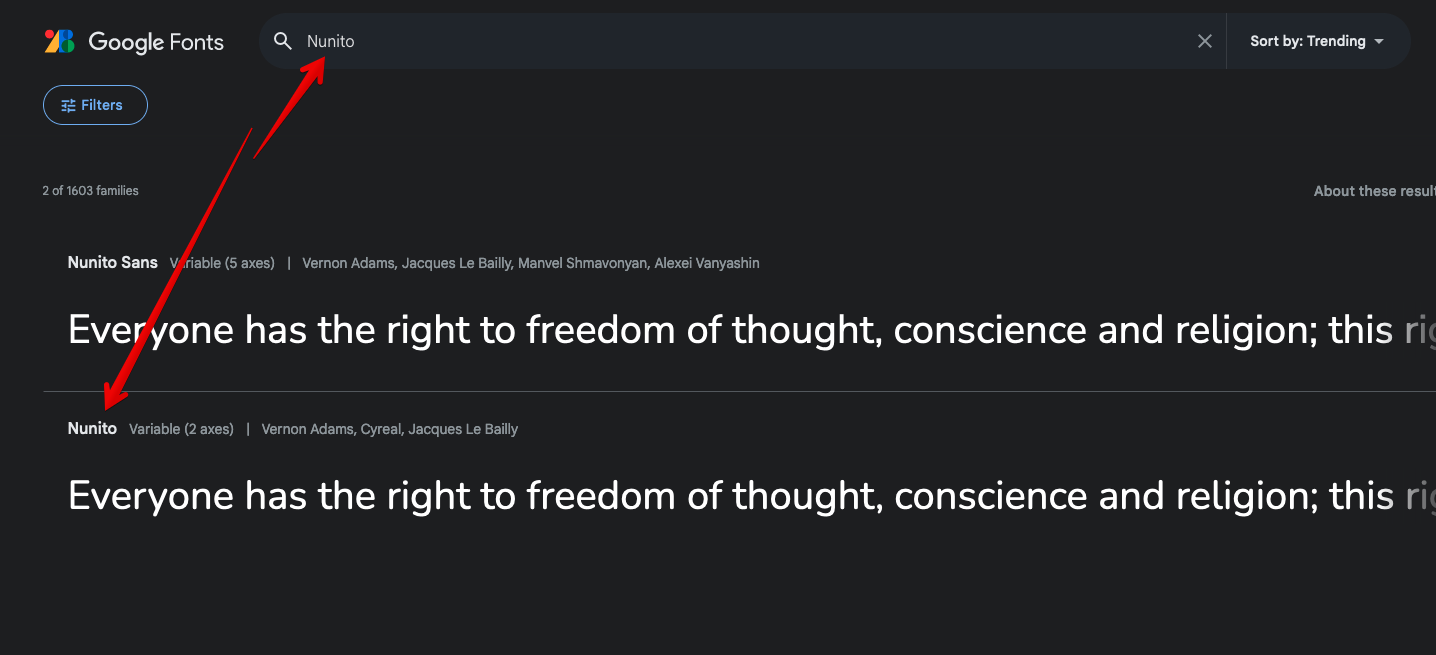
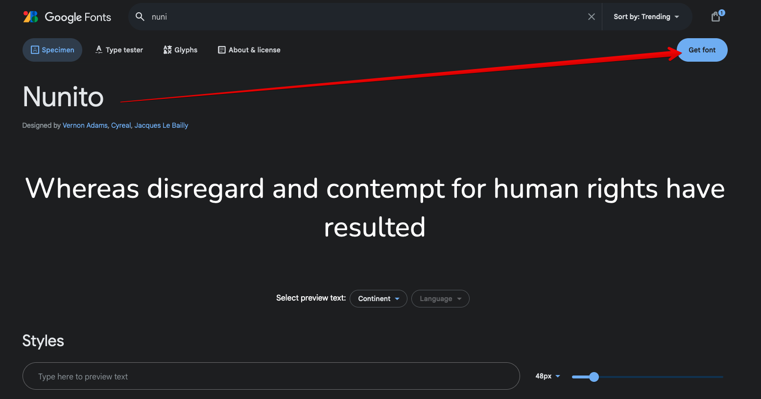
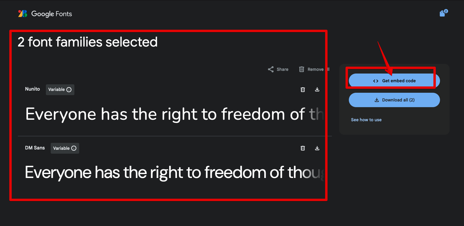
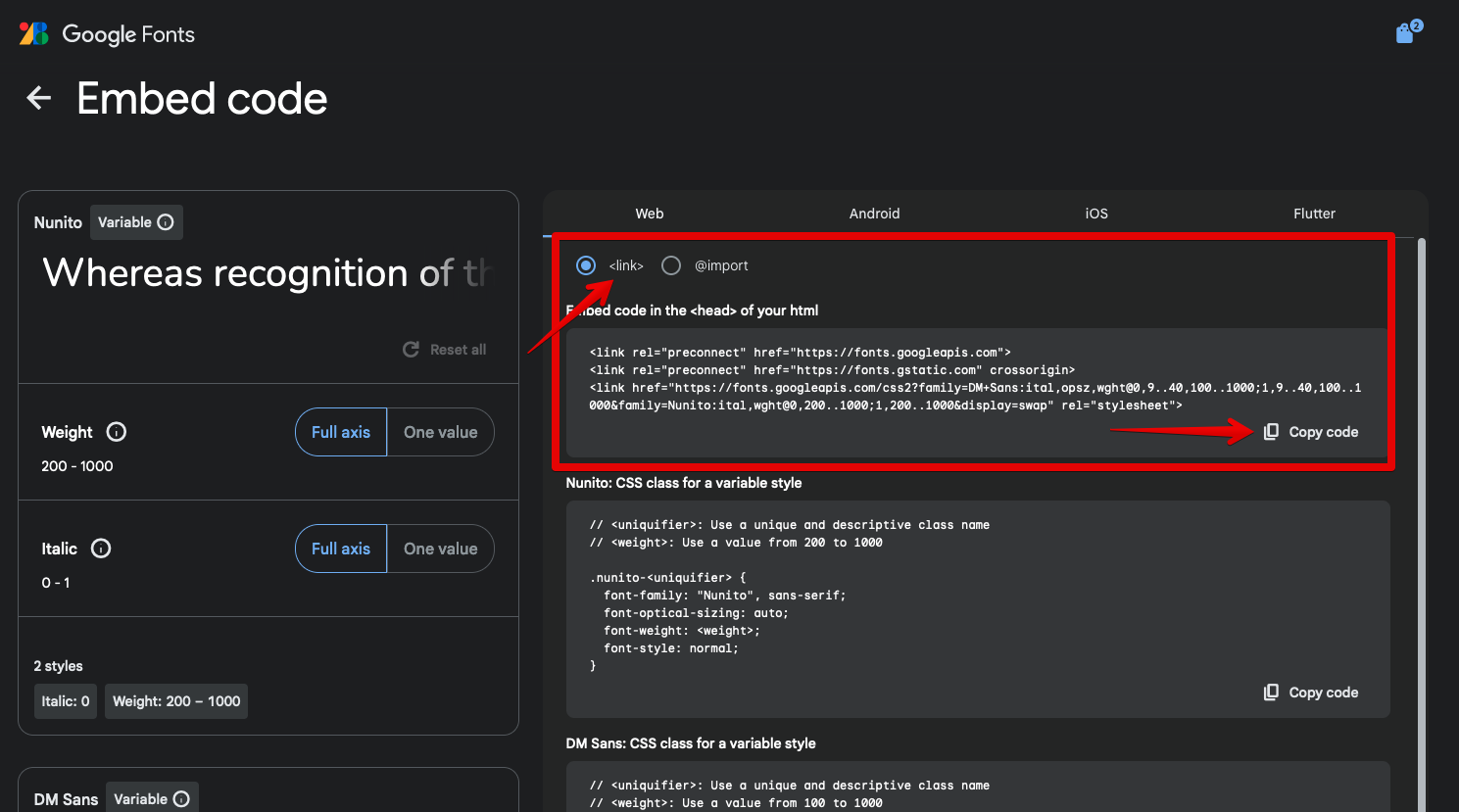
There’s an important caveat regarding the fonts used in our design, Nunito and DM Sans. These are Google Fonts. To use them on our page, we need to go to the Google Fonts website and configure them. Here is what you need to do:
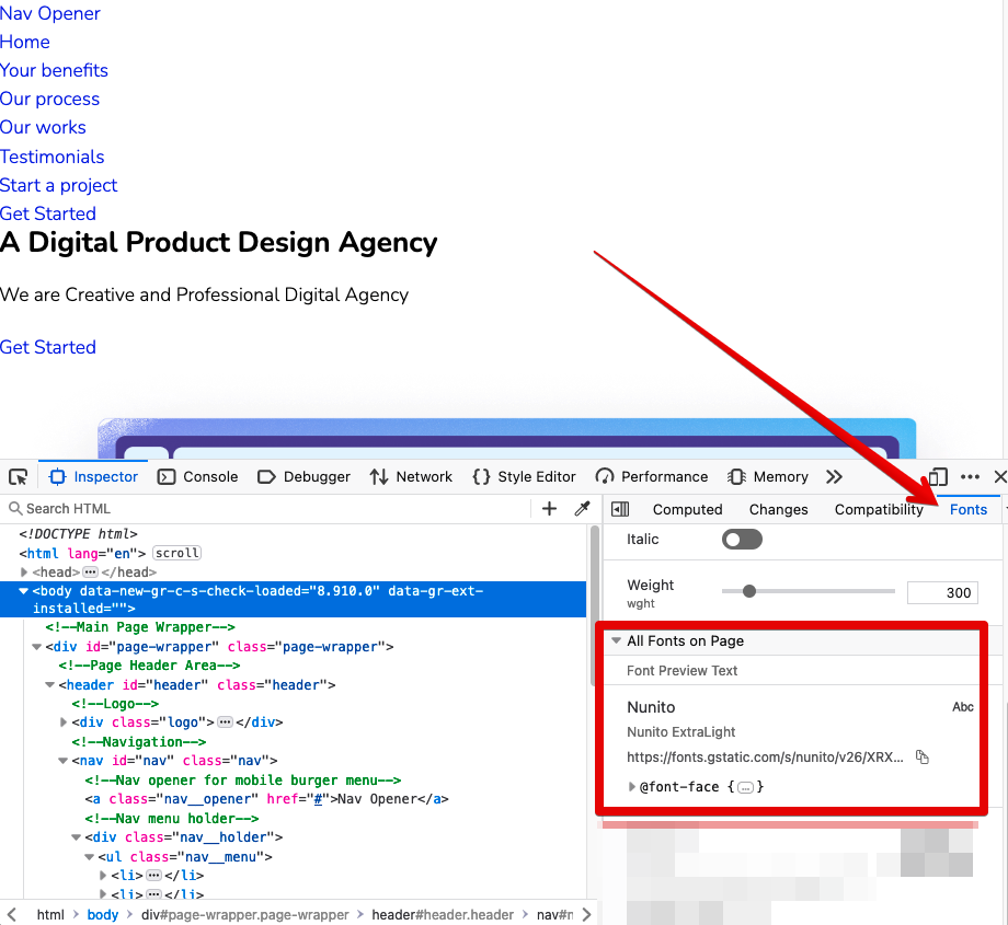
To make sure the Google fonts we’ve downloaded are working properly, open the Developer Tools in your browser and check the Fonts tab:
Setting up the colors.
The next important step in the project is to set up colors for the page. The most effective way to do so is to create CSS variables since color is a property that’s reused very often on web pages. Read more about creating CSS variables.
Add the :root pseudo selector to the top of the styles.css file and create color variables within it:
In this project, we’re using Icomoon font icons. So, first you need to set them up. Refer to the appropriate section at the end of this post for detailed instructions on how to create custom icons on Icomoon.
Once you’ve finished configuring Icomoon icons, you can use their codes inside the CSS rule sets this way: src: url(“../fonts/icomoon.ttf?z8q1or”) within the @font-face rule set after the body rule set. Here’s the CSS code:
With the essentials of CSS styling out of the way, you can proceed to styling the specific sections and components of our web page. But before you do that, there’s one super-crucial aspect of the design to code conversion process we need to discuss: responsiveness. In a nutshell, this means that a web page should render equally well no matter the device a user is browsing it on.
When it comes to making web pages responsive, we can apply two methods: mobile-first and desktop-first. Let’s take a closer look at these methods:
Mobile-First Approach
This method involves creating a mobile view design by default and then using certain CSS breakpoints like different device resolution pixels as start and end points for styling the page accordingly.
Some standard breakpoints for the mobile-first approach include mobile (min-width: 320px or 375px up to 767px), tablet (min-width: 768px up to 1023px), and desktop (min-width: 1024px and up).
Although these are some standard breakpoints, we can use any breakpoint value that we need according to a specific design.
At the heart of web responsiveness is a CSS media query. This is like a magic spell that lets your website change its look based on the size of the screen it’s being viewed on.
For example, you can have one style for a big computer screen and a different style for a small phone screen. This helps make sure your website looks good and is easy to use no matter what device someone is using to look at it.
This method involves creating a desktop view design by default and using specific CSS breakpoints to modify styles according to the design. Some standard desktop-first breakpoints include desktop (min-width: 1024px and more with no need for a media query), tablet (max-width: 1023px), and mobile (max-width: 767px).
For our tutorial, we have chosen the mobile-first approach. It’s extremely popular in web development today because most people now use their smartphones to browse the internet.
Now that you know why responsiveness matters and what approaches to implementing it exist in web development, it’s time to style the sections, making them cross-device compatible.
Follow these steps:
Define the generic container
/* Generic container styles */
.container {
width: 100%;
margin-left: auto;
margin-right: auto;
padding-left: 20px;
padding-right: 20px;
/* design container width is 1170px. So, with the left/right spacing of 20px,
the container box-model width becomes 1210px.
So, we are setting max-width to 1210px, which makes the container responsive because of the max-width property.
*/
max-width: 1210px;
}
Style the header section.
Begin by inspecting the properties of these header elements:
Logo
Menu Button (dimensions and typography)
Button dimensions
Header button typography
Now, let’s move on to CSS. To style the header, you need to use the header class .header instead of the id #header. Why? Because classes are designed to create styles that we can reuse whenever there is a need for style inheritance.
The header styles will include the following classes:
Header class .header {}
Header logo header .logo {}
Header nav .header .nav {}
Header nav menu list .header .nav__menu
Header nav menu list li, a etc.
.header .nav__menu li {} and .header .nav__menu a {} etc.
Header button .btn which is generic / global style.
Next, let’s focus on making the header responsive. To achieve this, you need to write one media-query for each breakpoint and add all styles inside that media-query instead of writing a style individually for each element. Put these responsive styles at the end of the file after the default styles.
Here is the code:
/* Responsive styles */
/* Tablet device and up */
@media (min-width: 768px) {
/* For header and menu we followed mobile styles */
}
/* Desktop small device and up */
/* For Desktop and up we updated the header and menu to match design layout */
@media (min-width: 1024px) {
.header {
padding-right: 20px;
}
.header .nav__holder {
position: static;
width: auto;
transform: none;
padding: 0;
background: none;
}
.header .nav__menu {
display: flex;
align-items: center;
gap: 20px;
font-size: 14px;
}
.nav__opener {
display: none;
}
}
/* Desktop large device and up */
@media (min-width: 1200px) {
/* For Desktop and up we updated the header and menu to match design values as well */
.header {
padding-left: 60px;
padding-right: 60px;
padding-top: 30px;
padding-bottom: 30px;
}
.header .logo {
width: 210px;
}
.header .nav__menu {
font-size: 16px;
}
.btn {
font-size: 14px;
padding: 20px 50px;
}
}
So, the final code for the header section looks like this:
/* General CSS reset and base styles */
/* CSS variables */
:root {
    --color-white: #ffffff;
    --color-white-300: rgba(255, 255, 255, 0.3);
    --color-white-800: rgba(255, 255, 255, 0.8);
    --color-black: #000000;
    --color-primary: #595e64;
    --color-secondary: #3b3e43;
    --color-brand: #57b3fe;
    --color-highlight: #00a077;
    --color-dark: #0d0d0d;
    --color-orange-300: #ffe7db;
    --color-orange-600: #fead86;
    --color-green-300: #e7f2ef;
    --color-green-400: #c0f2ef;
    --color-green-500: #51a690;
    --color-green-600: #00a198;
    --color-yellow-300: #faf3d8;
    --color-yellow-400: #ffcf00;
    --color-purple-300: #ede7f2;
    --color-purple-600: #75578e;
    --color-blue-300: #d8f0fa;
    --color-blue-600: #0985b9;
    --font-dm-sans: "DM Sans", "Arial", "Helvetica", sans-serif;
    --font-nunito: "Nunito", "Arial", "Helvetica", sans-serif;
}
/**
* Set up a decent box model on the root element
*/
html {
box-sizing: border-box;
}
/**
* Make all elements from the DOM inherit from the parent box-sizing
* Since `*` has a specificity of 0, it does not override the `html` value
* making all elements inheriting from the root box-sizing value
* See: https://css-tricks.com/inheriting-box-sizing-probably-slightly-better-best-practice/
*/
*,
*::before,
*::after {
box-sizing: border-box;
}
/* body has default margin */
body {
margin: 0;
}
/* h1-h6 has default margin top/bottom */
h1,
h2,
h3,
h4,
h5,
h6 {
    margin: 0 0 20px;
    font-family: var(--font-dm-sans);
    font-weight: 500;
    color: var(--color-primary);
}
/* p tag has default margin top/bottom */
p {
margin: 0 0 20px;
}
/* ul/ol has default maring,padding and list style like bullets */
ul,
ol {
margin: 0;
padding: 0;
list-style: none;
}
/* anchor tag has default decoration underline */
a {
text-decoration: none;
}
/* Responsive image property */
img {
max-width: 100%;
height: auto;
}
/*
Page wrapper styles:
This style will not let any elements to overflow from the page wrapper
*/
#page-wrapper {
position: relative;
overflow: hidden;
}
/* Typography */
body {
    font-family: var(--font-nunito);
    font-size: 16px;
    line-height: 24px;
    font-weight: 300;
    color: var(--color-primary);
}

/* Icomoon font styles */
@font-face {
    font-family: "icomoon";
    src: url("../fonts/icomoon.ttf?z8q1or") format("truetype"),
        url("../fonts/icomoon.woff?z8q1or") format("woff"),
        url("../fonts/icomoon.svg?z8q1or#icomoon") format("svg");
    font-weight: normal;
    font-style: normal;
    font-display: block;
}

[class^="icon-"],
[class*=" icon-"] {
    /* use !important to prevent issues with browser extensions that change fonts */
    font-family: "icomoon" !important;
    speak: never;
    font-style: normal;
    font-weight: normal;
    font-variant: normal;
    text-transform: none;
    line-height: 1;

    /* Better Font Rendering =========== */
    -webkit-font-smoothing: antialiased;
    -moz-osx-font-smoothing: grayscale;
}

.icon-clear:before {
    content: "\e900";
}

.icon-close:before {
    content: "\e900";
}

.icon-menu:before {
    content: "\e901";
}

.icon-instagram:before {
    content: "\e902";
}

.icon-twitter:before {
    content: "\e903";
}

.icon-facebook:before {
    content: "\e904";
}

.icon-bag:before {
    content: "\e905";
}

.icon-graph:before {
    content: "\e906";
}

.icon-search:before {
    content: "\e907";
}

.icon-users:before {
    content: "\e908";
}

.icon-chart:before {
    content: "\e909";
}

.icon-discount:before {
    content: "\e90a";
}
/* Generic container styles */
.container {
width: 100%;
margin-left: auto;
margin-right: auto;
padding-left: 20px;
padding-right: 20px;
/* design container width is 1170px so with left/right spacing of 20px,
the container box-model width becomes 1210px.
So we are setting max-width to 1210px which makes the container also responsive due to max-width property
*/
max-width: 1210px;
}
/* Header styles */
.header {
position: absolute;
top: 0;
left: 0;
width: 100%;
z-index: 999;
padding-top: 20px;
padding-bottom: 20px;
padding-left: 20px;
padding-right: 60px;
display: flex;
align-items: center;
justify-content: space-between;
}
.header .logo {
width: 120px;
}
.header .logo img {
display: block;
}
.header .nav__holder {
background: var(--color-brand);
position: fixed;
top: 0;
right: 0;
bottom: 0;
width: 280px;
transform: translateX(100%);
z-index: 999;
padding: 20px;
transition: transform 0.3s ease-in-out;
}
.header .nav__menu {
font-size: 16px;
line-height: 1.2;
font-weight: 500;
font-family: var(--font-dm-sans);
}
.header .nav__menu a {
color: var(--color-white);
transition: color 0.3s ease-in-out;
display: block;
padding: 5px 0;
}
.header .nav__menu a:hover {
color: var(--color-secondary);
}
.nav__opener {
position: absolute;
right: 20px;
top: 20px;
font-size: 28px;
color: var(--color-white);
}
.nav__opener--close {
display: none;
}
/* Generic Button styles */
.btn {
    display: inline-flex;
    align-items: center;
    justify-content: center;
    padding: 6px 15px;
    background: var(--color-white);
    color: var(--color-brand);
    font-family: var(--font-dm-sans);
    font-weight: 700;
    font-size: 12px;
    line-height: 21px;
    border-radius: 50px;
    text-transform: uppercase;
    transition: color, background 0.3s ease-in-out;
}

.btn:hover {
    background: var(--color-secondary);
    color: var(--color-white);
}
/* Responsive styles */

/* Tablet device and up */
@media (min-width: 768px) {
    /* For header and menu we followed mobile styles */
}

/* Desktop small device and up */

/* For Desktop and up we updated the header and menu to match design layout */
@media (min-width: 1024px) {
    .header {
        padding-right: 20px;
    }

    .header .nav__holder {
        position: static;
        width: auto;
        transform: none;
        padding: 0;
        background: none;
    }

    .header .nav__menu {
        display: flex;
        align-items: center;
        gap: 20px;
        font-size: 14px;
    }

    .nav__opener {
        display: none;
    }
}

/* Desktop large device and up */
@media (min-width: 1200px) {

    /* For Desktop and up we updated the header and menu to match design values as well */
    .header {
        padding-left: 60px;
        padding-right: 60px;
        padding-top: 30px;
        padding-bottom: 30px;
    }

    .header .logo {
        width: 210px;
    }

    .header .nav__menu {
        font-size: 16px;
    }

    .btn {
        font-size: 14px;
        padding: 20px 50px;
    }
}
Style the Hero section.
Just like with the header section before, first inspect the properties of the Hero Section elements in the Figma design.
Before we round up the development of our web page, there’s one element that requires our attention: the mobile menu. Currently, it doesn’t look functional. To fix this problem, we need to apply a bit of JavaScript (JS) to make the menu interactive. Here are the steps to follow:
Create a JS file name app.js inside the assets/js folder.
Add a link between this file and the HTML code within index.html by using the <script> tag just before the end of the <body> tag like this:
// Load the JavaScript after all the DOM elements are loaded
document.addEventListener("DOMContentLoaded", function () {
    initMobileBurgerMenu();
});

function initMobileBurgerMenu() {
    const body = document.body;
    const navOpeners = document.querySelectorAll(".nav__opener");

    navOpeners.forEach((opener) => {
        opener.addEventListener("click", () => {
            body.classList.toggle("nav--active");
        });
    });
}
Improving Your Webpage
Now that we’ve walked through the main steps of developing the web page, it’s time to enter a critical phase of refinement and testing. Even after your web page seems complete, there’s always room for improvement. Here’s what you should do:
Review and refine. Review your HTML and CSS code, comparing it with the Figma design to ensure accuracy. To compare the design accurately you can use Pixel Perfection browser extension tools like (Pixel Perfect Pro, Perfect Pixel, etc.) and make any necessary adjustments to match the design closely.
Cross-browser testing. Test your HTML/CSS code in different web browsers to ensure compatibility and consistent rendering.
Test responsiveness. Test your design on various devices and screen sizes to ensure responsiveness and proper layout adjustments.
Seamless Figma to HTML
Conversion
Get a high-quality, accessible,
and fully responsive website fast.
Use more vector assets like SVG for background and decorative graphics.
Add JavaScript to make the page more responsive to user interactions. For example, you can add page scroll animation.
Identify generic and reusable components and organize them in a way that allows you to use them over and over again or inherit their properties.
Showing Off Your Finished Work
Well done! You’ve successfully converted a Figma design into a functional web page. Show off the result to your friends or colleagues, priding yourself on what you’ve accomplished. You can compare your web page with one created by a professional developer.
Creating Custom Icons on the IcoMoon Platform
Finally, here are the instructions on creating Icomoon icons that mentioned earlier in the text.
Iconmoon offers a wide array of premade font icons that you can use right off the bat if they match your design. However, now and then existing icons do not match the design. In that case, you need to create your own custom font icons. Follow these steps:
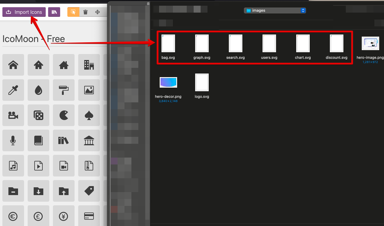
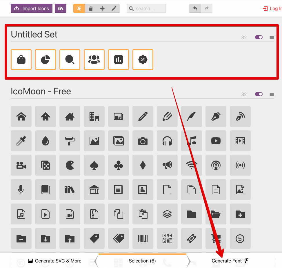
Export all icons in the SVG format and name them based on their function, such as chart.svg, search.svg, and so on. You can also choose existing icons from the IcoMoon platform.
After creating and loading a new project, you will have access to existing free icons to use and the option to create custom icons.
Import your custom SVG icons to create a font icon:
After the import is complete, we can see our icons inside the IcoMoon app:
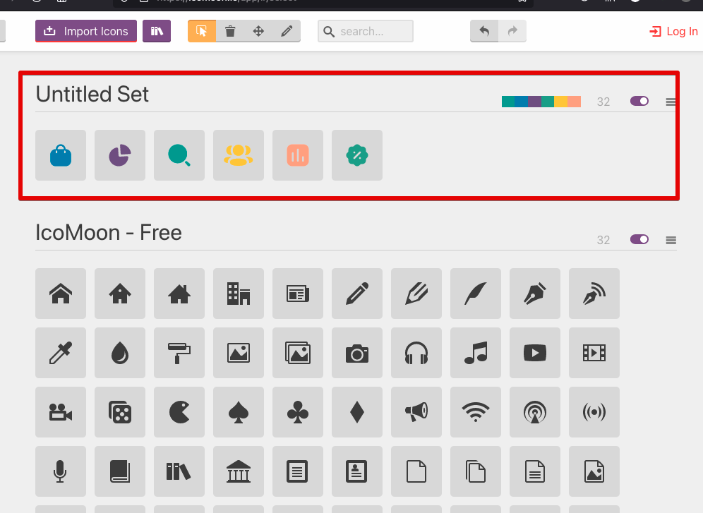
Select the icons for generation by clicking on each one.
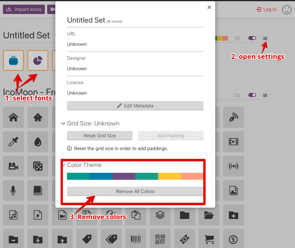
Since the icons have their own colors, we need to replace them with a default color. This way, you can set specific colors later from CSS. Click Remove All Colors:
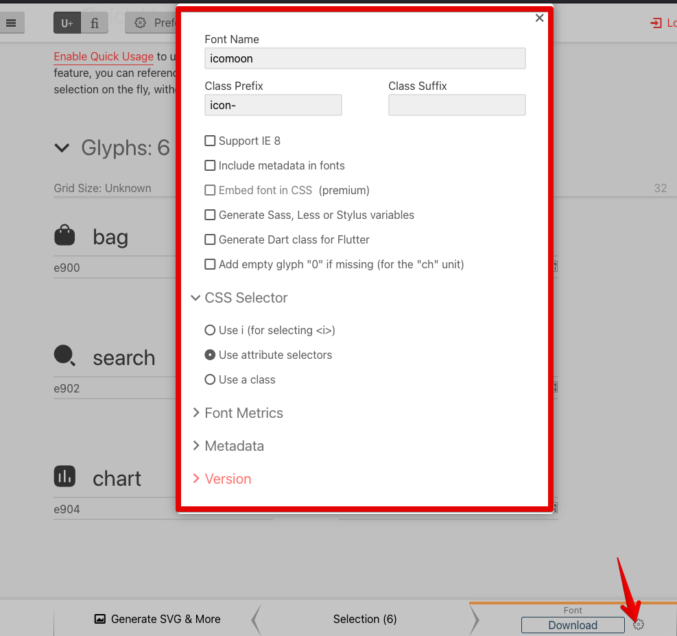
The icons are ready to be processed. Click Generate Font:
You should see the icons now. At the bottom of the app, there is a download button and the Settings icon.
The generator creates default CSS styles and files, but we have other options like SCSS in the settings screen as well. For this tutorial, we have selected the default options.
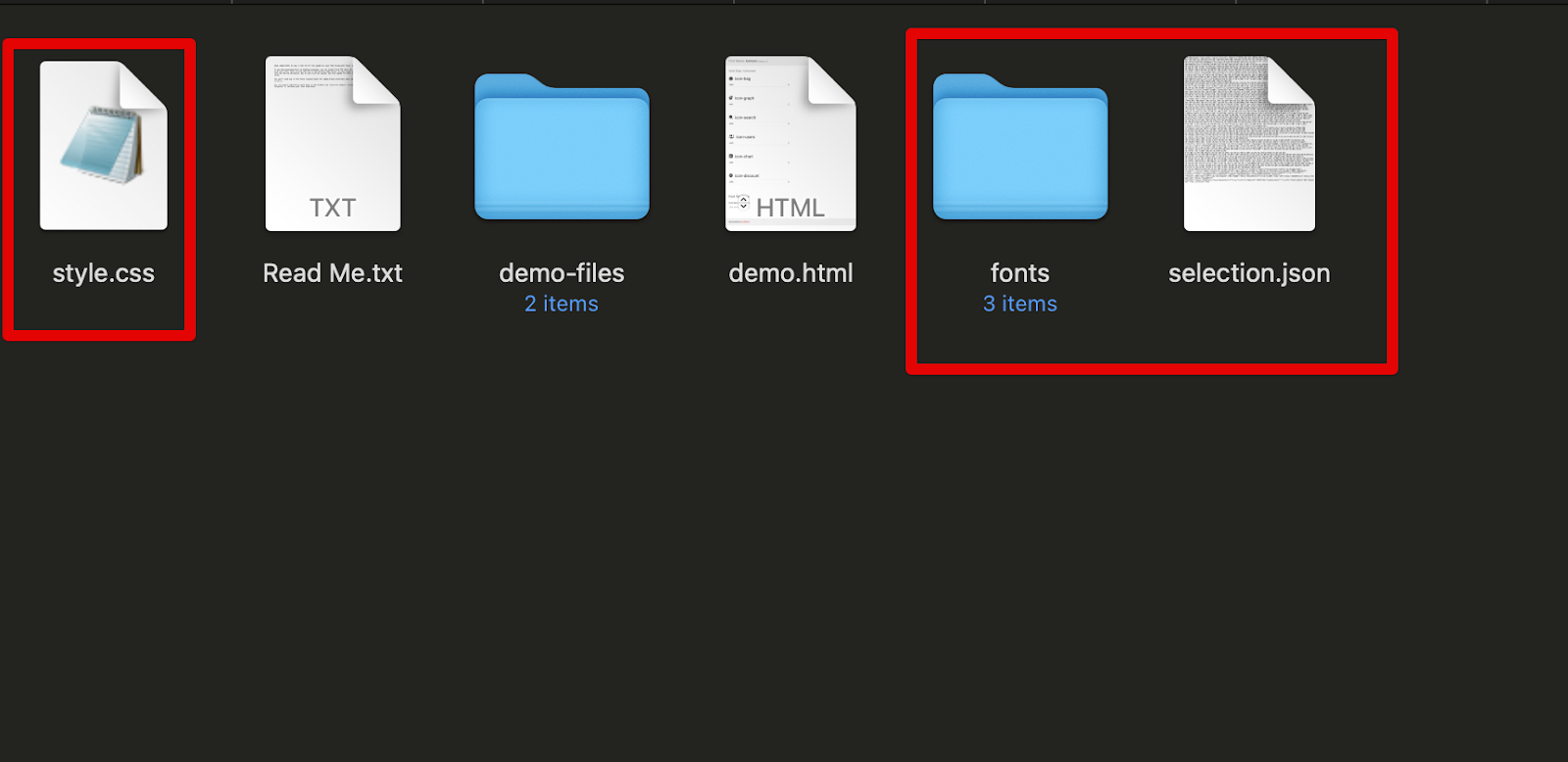
Click Download to get these files:
We will only need style.css , the fonts folder, and selection.json. The latter is just a backup config file for our selected icons, we can import this file into any IcoMoon project to use the same icon fonts data and settings.
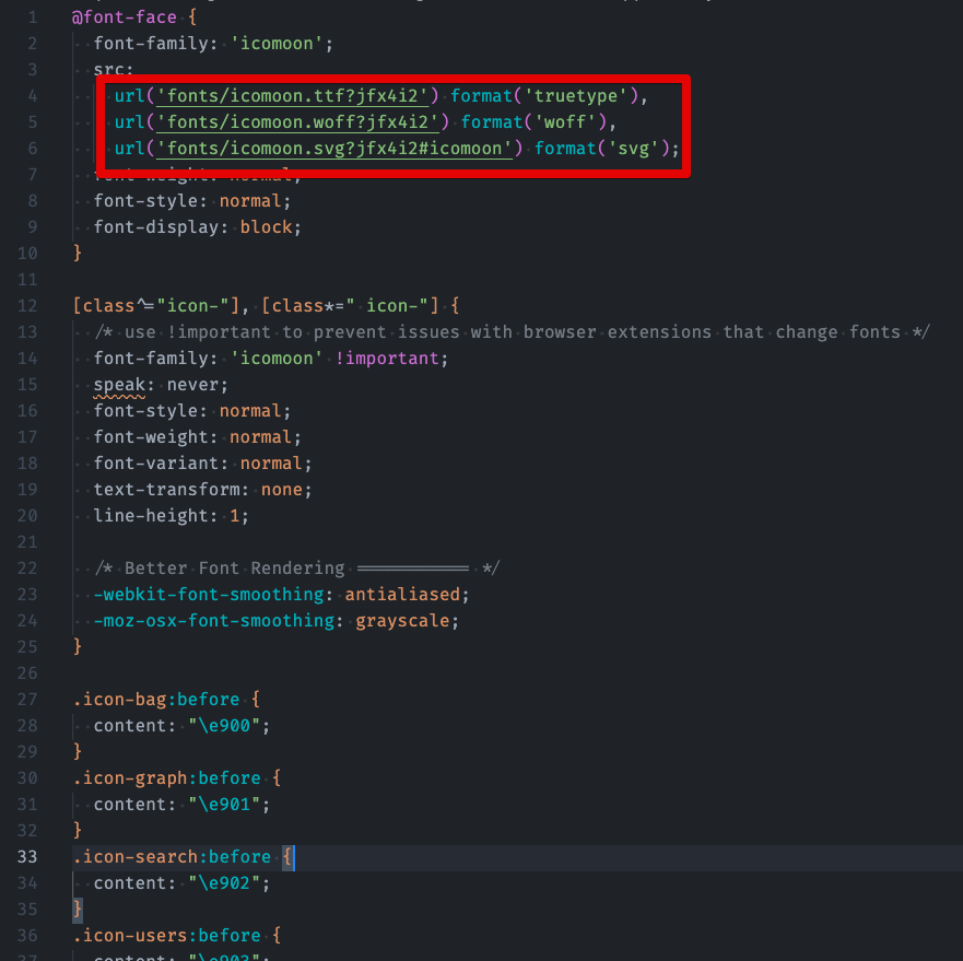
Add the Icomoon fonts and styles to our project. By default, the IcoMoon CSS will have these properties:
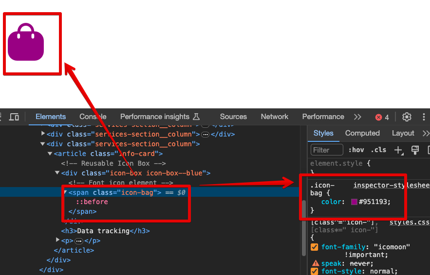
So, you need to specify the correct URL for our font assets. Now, you can use the font-icon class in our HTML. For example, if we want to use icon-bag, we just need to give this class name to the HTML selector:
The output will look like this:
Now, you can modify the CSS properties of this icon, such as the color, font-size, etc.:
Final Words
Wrapping up this tutorial on turning Figma designs to HTML/CSS, we hope it’s been really helpful for you. Moving from design to actual code is a big step in making your website ideas come to life, and knowing how to do it is super useful.
At GetDevDone, we’re all about helping you with your website projects in any way we can. We’ve got you covered for everything from turning designs into code (whether it’s from Figma, Sketch, Ai, PSD, or something else) and building visually stunning and well-performing WordPress sites to setting up online stores with Shopify and WooCommerce and creating engaging banner ads for your marketing campaigns.
If you’re into easier-to-use options, we also work with platforms like Webflow, Hubspot, and other low-code/no-code solutions to get your site up and running fast without having to code. And for those who need something more custom, like a web app, we’re great with technologies such as React, Angular, and Vue. No matter what you need for your website, we’re here to help make it happen.
Reach out to us for a consultation and a free quote today!
In this post, we talk about one of our front-end + back-end development projects. You will learn about the challenges we faced, the solutions we offered, and the results we achieved.
Newsletters and RSS feeds are important tools for keeping up with the ever changing world of web design and development. With so much information out there, it’s easy to cram your inbox with junk. No worries! We’ve scoured the internet to find the most relevant and informative web dev newsletters. We think these fall into […]
“Designed for humans first and machines second”, microformats are HTML based formats for common data types embedded in HTML documents, mostly by using specific values for class or rel attributes. Using microformats makes it easier to publish and reuse various information such as describing people, events, tags and bunch of other relevant information that can […]


