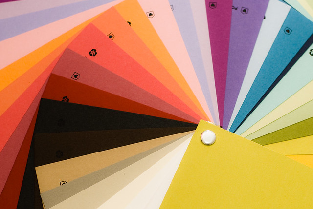
Choosing a color palette is a very important part of the design process. There is no right way to choose which colors to use in your project, but there are some things to keep in mind that might help guide you to a great color combination.

Brand Identity
Your brand is what defines your business, your website, and your whole identity to your potential clients. So before choosing a color palette, you’ll need to define what you want your brand to say. If you haven’t already done so, write down (or ask your client to do this) a few sentences about what you want your brand identity to be. This is different from your mission statement. You should think about what sets your business apart from others in your field.
Emotions
Color invokes emotions, whether we are cognizant of these emotions or not. Different colors mean different things to different people, so pinning down exactly what your color scheme says can be tough, but there are a few general guidelines to keep in mind. A high-energy type of brand could choose brighter colors, while mature brands might go with more muted colors.
White space
You definitely want colors to spruce up your brand image, but never ever underestimate the power of white space. This “empty space” gives your visitors or potential clients a little room to breath. You don’t want your color choices to overwhelm people, so you need to have a good neutral color to anchor your site or other brand materials. Your white space doesn’t necessarily have to be white. It can be off-white or another light, neutral color that goes well with the rest of your color choices.
Self-Expression
This is especially important if you’re designing for a sole-proprietor, freelance or personal website. The colors should reflect who you are, so naturally you should like them. Start by picking colors that you are naturally drawn to, or ask friends and family to choose colors that remind them of you. You could also start by thinking about colors that you wear often or use to decorate your home or office.
Complementary
You obviously want to make sure that your colors look good together. You can always refer to a color wheel for complementary colors, or even use a free service like colorschemedesigner.com to find colors that work well with one another. Or you can just use trial and error, and ask others to give input along the way.
Contrasting
Even if you want a simple design, make sure you have enough contrast on your site, logo, or design to draw attention. Contrasting colors will catch people’s attention, make your text easier to read, and make your images pop.
Audience
This is possibly the most important thing to think about when choosing a color scheme. Yes, you want to like your color scheme, but ultimately you are creating a brand so that you will be recognizable to your customers, clients, and visitors. That means it should be something that appeals to that audience. You might need to do some research to find out who your audience is, or even do some testing with potential color combinations. But always keep in mind who you are designing for and what the ultimate purpose is.

A color scheme is one of the most important aspects of design, and one that can never be planned too carefully. There is no magic formula for finding the perfect color scheme. You just need to do the research and have an idea of what you like and what your clients might like.


